A Cluster of a Cluster – Toyota’s Unforced Misstep
By Phil Royle — Jan. 6, 2023
Vehicle interior design and ergonomics are far from my calling in life. After 20-plus years reviewing vehicles, I’ve discovered that it takes a lot for me to dislike a driving space. Sure, some controls might be better served elsewhere on the dash, or a touchscreen might be performing too many duties (I’m looking at you, Tesla), but in all, I admit that most of these foibles can be easily adapted to by a vehicle owner. Yet when it comes to Toyota’s latest gauge pod and steering column design – well, it’s a bit of a cluster.
When Toyota unveiled its bZ4X electric SUV in October 2021, many pundits commented on the curious placement of the gauge pod directly in front of the driver. Positioned seemingly too far forward on the steering column, automotive journalists – me included – were curious how it would work in real life.
Not that a gauge cluster should be close to the driver. I’ve always found the tach in the Mini Cooper to be too close. But perhaps Toyota’s gauge cluster, comparatively placed miles away from the driver’s seat, would act more as a heads-up display. I wouldn’t know for sure until I sat in one.
When I did, I found myself facing a worse-case scenario.
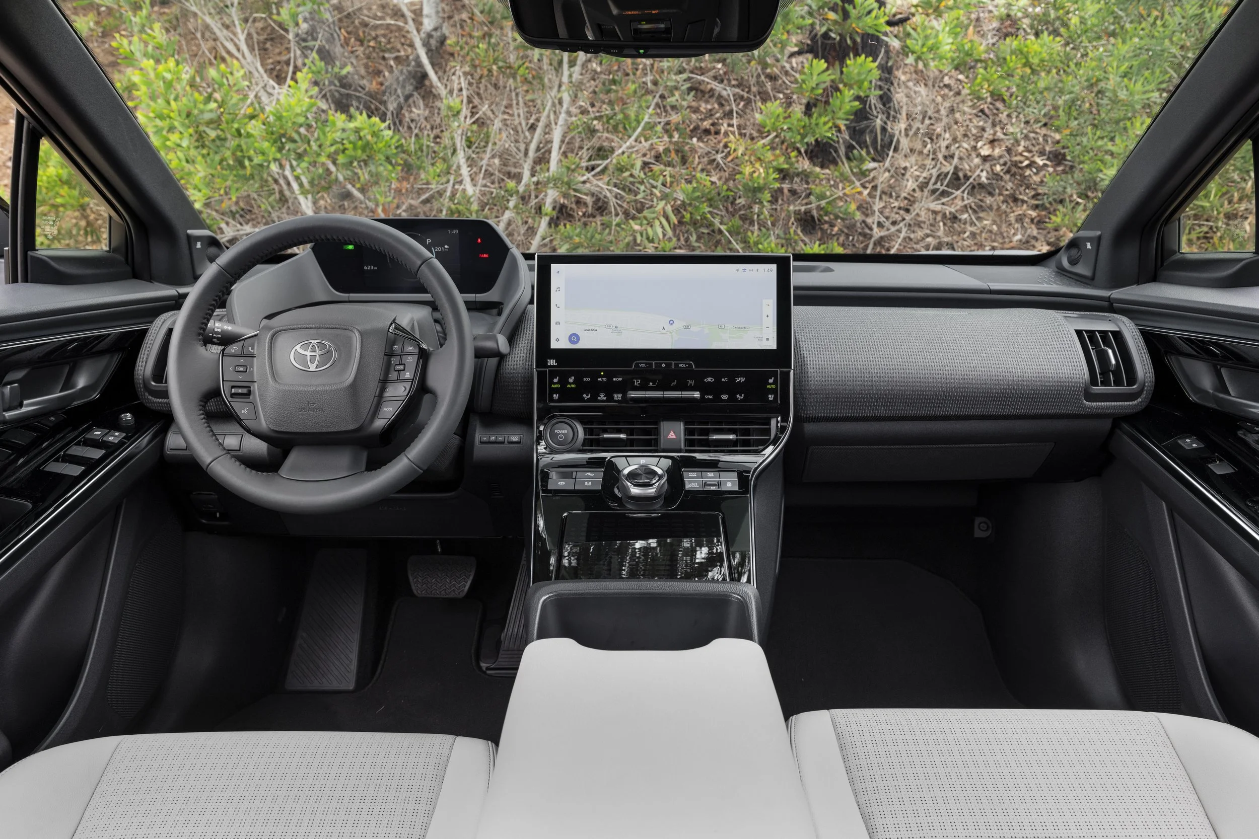
Even in Toyota’s official press images, the gauge pod on the bZ4X is difficult to see. (Image courtesy Toyota)
Comfortably seated in Toyota’s first modern EV SUV, I discovered the bZ4X’s gauge cluster being positioned far from the driver is the least of its problems – it turns out, the view of the gauge pod is utterly obstructed by the steering wheel. This can be solved in Japan by opting for the “yoke” steering wheel, but that is a workaround to a problem that shouldn’t exist in the first place. It seems the topless “yoke” steering wheel isn’t an option for the U.S. market, making the visibility issue currently unsolvable for consumers in the United States.
Worse yet, it appears Toyota is doubling down on the pod placement, incorporating it into the 2023 Prius – a vehicle that’s receiving rave reviews for its radical exterior design features and powerful motor/engine combination.
Still, it gets worse.
The redesigned 2023 Toyota Prius houses the same steering wheel and gauge pod as the bZ4X, leaving drivers with a less than ideal view of the car’s vitals. (Image courtesy Toyota)
The steering column in the bZ4X, and presumably the new Prius, is far from adjustable. Set to its highest setting, most would think the wheel is actually at its lowest point.
If Toyota wants a prime example of how a gauge cluster and steering wheel should work, the company should look no further than the Volkswagen’s ID lineup, which just about nails the setup both in cluster visibility and steering wheel adjustability.
Volkswagen very much nailed gauge pod placement and steering wheel adjustability in its ID lineup — something Toyota should take note of. (Image courtesy Volkswagen)
If the gauge cluster and steering wheel adjustment problems were exclusively a bZ4X gaff, it might be possible to overlook the design as an unfortunate quirk of the new EV, but with its appearance in the new Prius, it seems this design element is spreading. It’s a decision that will cost Toyota in sales.
The cluster is something buyers will immediately notice upon a test drive and will not be able to adapt to. For the life of the vehicle, the gauge cluster on these Toyota vehicles (and by proxy, the Subaru Solterra) will be forever obstructed.
In today’s automotive market, manufacturers are moving fast to keep up with the titan that is Tesla, but it seems that in its haste, Toyota has foregone focus groups, or even input from its employees who undoubtedly voiced similar concerns – because the design of this cluster and steering column simply isn’t OK.
It’s too late to fix the cluster and steering column in this generation of the bZ4X and new Prius, but I’m holding out hope that Toyota doesn’t extend this unfortunate ergonomic faux pas to its future lineup. Should Toyota opt to go all-in on this design, you can count me – and likely many other buyers – out.
(Main image by Phil Royle)
- Store - Podcast - Facebook - Google News - Twitter -


